The Art Corner: Version 20
Trader Sam | March 26, 2011
With the last site re-design (version 20) lasting only three months, let’s take a look at some initial sketches. They introduced a few design ideas that created unforeseen formatting problems.
The design began with the re-structuring of the site, internally, splitting everything up into different categories. Before, there were only three.
One popular feature, at the request of guests, became its own menu header: the paper models. Other important areas were given easier access (the site map and the contact page to name a couple).


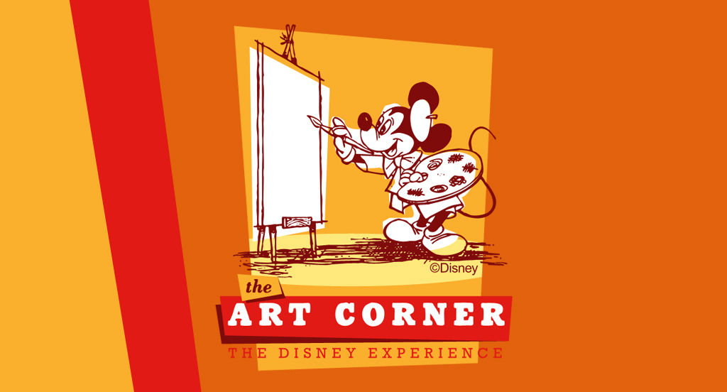
After breaking the site down into specific categories, it was time to start creating some of the logos that would be seen, including the website’s new logo. The first draft of the site logo included a gloved hand, rather than a castle.
Finally, the a rough page layout was fleshed out. The final design had the sidebar items inside the same container for the main content, which wreaked havoc on trying to organize content. A major flaw.
The navigational menu was also cumbersome, involving large graphics, and having less functionality on the splash page. That hindered navigation, even for myself. Another major flaw!
Do you have a thought about this post? Why not leave a comment . . .